April 2017
Perfect pastels
19/04/17 18:55 Filed in: Interiors
Catchpole & Rye, purveyor of fine sanitary ware for luxurious bathrooms, offers its ideas for updating the ‘smallest room in the house’ this spring using pastel colours.
Spring is in the air, and in fashion and interiors that means one thing: a proliferation of pastels! When it comes to the bathroom, however, a gentle, muted colour palette is not just for warmer months – it works wonderfully all year round, creating a peaceful, tranquil ambience in a room made for relaxation and indulgence.Traditionally seen as feminine, romantic and perhaps a little saccharine, pastels are finally showing their more versatile side. Pastels also look fabulous paired with metallics such as brass and copper – another sign that they’re a great choice for bathrooms.
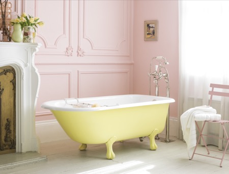
For a gentle introduction to this look, stick to a neutral palette for a bathroom and introduce the chosen pastel as for any accent colour. Catchpole & Rye baths can be painted any shade chosen: powder blue, muted mint, lemon yellow or coral pink, a crisp background will stop the overall scheme from appearing too sugary sweet. The room pictured top looks so inviting – the pale walls and floor create a serene backdrop for the soft blue bath.
Ice-cream shades can help to counter the clean lines and hard surfaces of a bathroom, softening the space and adding a fun, quirky edge. For those who have had their fill of industrial chic, this could be the perfect antidote!
By painting the bath a slightly paler tint of pink than the walls, it is given subtle prominence in a sophisticated scheme.
Of course, it doesn’t have to be the bath that takes centre stage – cisterns and vanity units can also be painted to suit a scheme where pastel tones add a splash of individuality without overpowering the room.
Adding vibrant bright or dark, moody colours into the mix brings pastels bang up to date. As well as creating a strong sense of drama, an atmospheric wall colour adds definition to a pistachio green bath, the contrast heightening the intensity of both colours and giving the paler shade more gravitas. Colour layering in this scheme could have a touch of the tropical about it – perhaps a fearless combination of zesty orange, sky blue and sunshine yellow would feel joyful and full of fun.
See the Catchpole & Rye website for more information and inspiration.
Catchpole & Rye
Website: www.catchpoleandrye.com
Telephone: London showroom 020 7351 0940
The secret of great interior design
19/04/17 17:16 Filed in: Interiors
Interior designer Sophie Paterson talks to Jane Pople about the secrets of good interior design and how she overcame career challenges to be where she is today.
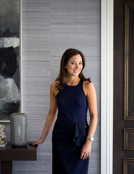
Sophie Paterson has an enviable combination of tenacity and business acumen, coupled with wonderful creativity and a natural talent for style. These skills have seen her rise through the ranks to head her own studio, Sophie Paterson Interiors, and become renowned across the industry. Her portfolio boasts many stunning projects that range from a luxury Chelsea apartment to a sprawling urban family home.Q Sophie, what is the secret to interior design?
A I’m not sure it’s a secret, but I think the key is really prioritising the functionality of the space and not just going for something that will look good in a photo. Having lived in various properties I have designed, I’ve learnt on a personal level how important comfort and practicality can be. Small things like having a table in reach of all your chairs so you can put down a drink, having fabrics that don’t give you a nervous tick every time someone sits on them, sofas that feel comfortable to sit on, rugs that disguise stains, wall coverings that resist scratches and marks. I think if you are designing high-end residential projects and you haven’t lived in one of your designed interiors, you could be tempted to prioritise aesthetics over functionality which is never the correct choice. Every client and every home needs to take practicality and comfort into account in order to be truly luxurious. Otherwise you are just living in a show home not a real home.
Q What was the biggest challenge you faced when setting up your own interior design studio?
A There were many challenges ¬– obtaining trade accounts is one hurdle that springs to mind – you need trade account references to set up most trade accounts, so convincing the first fabric house to give a trade account is hard work! I remember being interviewed by Zoffany and Andrew Martin for a trade account, which was daunting at the time. Now I look back and think what was I worried about, but you have to constantly push yourself to grow, so things I used to get phased by don’t even register with me now as a stressful situation. When I look back, I think it’s a blessing that at the tender age of 24 I didn’t fully realise everything that was involved in setting up and running a successful design studio!
Q What is the best advice anyone has ever given you?
A Stop worrying about everything that could go wrong and start thinking about all the things that could go right. In reality, you will find a solution to any problem you come up against. If you think about everything that could go wrong, you’ll end up procrastinating or even failing to try.
Q How would you describe your own home style and what’s your favourite room?
A My home is classic contemporary with a little rustic chic thrown in. My favourite room is either the kitchen or my TV room because they are so relaxing to spend time in. My TV room has layers of gorgeous textures and comfort; my kitchen is such a great space for socialising. I love the views across the garden from all the French doors.
Q If you could design the interior for any space in the world, where would you choose?
A I get asked this question a lot. I don’t have a particularly interesting answer. To me the ideal project isn’t just about the building, it’s about the combination of the building, client, brief and budget. If you get all those things right, then magic happens!
Q What is your favourite type of project to work on and do you have a most memorable project?
A I like working on complete refurbishments where you get to see a total transformation, and I prefer to work on whole houses or apartments rather than just a few rooms, as I always feel the rooms that are left feel even worse after you’ve renovated the others to a high standard. One of my most memorable projects was designing the nursery for our Cobham project after the rest of the house. We had left this room earmarked as a future nursery. Unveiling the room to the clients was such an emotional experience. They were in tears, we were in tears and even our builder was spotted wiping a tear away! It was such a special room and turned out beautifully. Another noteworthy experience was the recent handover of a Knightsbridge apartment project. The client was very trusting and didn’t visit the project once in the year’s renovation. When we handed the turnkey project over even their personal photos were in the photo frames, candles lit and flowers in the vases. The client’s reaction was just so special and to see how much they loved it is why we all do this job.
Q How would you spend your dream day off?
A If I was in London then I’d either go to Scotts, Zuma or Roka for a long lunch with my husband and baby daughter. Food is one of my passions – often I can be eating one meal whilst planning my next! After that I’d check into the spa at the Corinthia for some pampering. The interiors and treatments there are spectacular.
Q Where is your favourite place in the world?
A One place where I really relax and switch off is my in-laws’ home in Ranch Santa Fe in California. The weather, the beautiful location with gorgeous beaches so nearby, the food, the activities (I love tennis, hiking and shopping!) and company is a great combination. I generally don’t like staying in hotels, so this is one of my favourite places to go to switch off.
Q What are your top three tips for interiors in 2017?
A Embrace metal finishes such as bronze and antique brass. Not only are they more fashionable than chrome, but this is a trend that has longevity – it’s a classic look so won’t look dated in five years.
Colour wise, I love burgundy red, as well as warm tones such as almond and rust on a neutral base.
Q What would you be doing if you weren’t an interior designer?
A Good question. I really don’t know! I love organising things and I’d also need something creative.
Q What does the future hold for Sophie Paterson Interiors?
A We are completing some very large projects this year: a multi-unit project in Marylebone comprising a townhouse, an apartment and all the communal spaces within a high end development, a 13,000 square foot new build house in Chelmsford, an apartment in Marbella, a Grade II listed apartment in Knightsbridge, an apartment in Mayfair and a Grade II listed apartment in Belgravia. We are also expanding our team to allow for the large new projects we have lined up for later this year, so exciting times.
Website: www.amara.com and www.sophiepatersoninteriors.com
This article first appeared in The Lux Pad, www.amara.com/luxpad
Opposites attract
12/04/17 12:44 Filed in: Gardening
Emanuela Alladio of Alladio Sims Garden Landscape Design Limited considers the art of combining contrasting textures in our outside spaces.
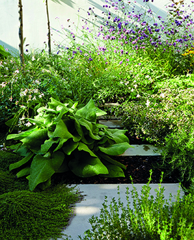
There are a million different shades of green in a garden. And when it comes to plants, many of them share at least one similarity – be it colour, form, shape or size. Yet in a successful garden each contrasting element – whether it’s a plant or hardscape – is able to contribute towards creating a sense of space, a certain mood and an excitement that sets the garden apart from any other space and draws eyes in. Exciting gardens know how to play with opposites, and how to successfully combine contrasting textures.
The key to the art of combining opposites relies on providing enough variation to create intensity without letting chaos settle in. A series of successful contrasting combinations in a garden introduces a layer of visual textures that lets our eyes ‘see’ each and every one of its elements.
The most obvious tools for creating texture in gardens are their building blocks – hardscape, plants and colour – constantly combined and rearranged until ultimate finesse is achieved.
Just like a chef would create a dish choosing each and every ingredient in the right quantity and introducing interesting flavour combinations by contrasting clashing ingredients, a garden designer sets out to create a garden by striving to achieve a very fine balance of all three of its main building blocks.
At the bottom of the pyramid is, of course, the hardscape – paths, patios, planters – key structural elements forming the backbone of visual texture, each material carefully chosen for its finish, that might contrast or absorb the texture from surrounding plants. A sleek, large, porcelain slab patio surrounded by soft linear and light reflecting grasses is a good example of contrasting textures and forms.
A step up is colour, to be found not only in flowers, but in bark, fruit and seeds, and in leaves too of course, to create a balanced backdrop of harmonious shades with peaks of interest in the form of contrasting colour combinations. Good examples of contrasting arrangements could be a blue geranium with a hot pink rose, or the lime green flower of alchemilla mollis against a purple heuchera or a black mondo grass.
And, of course, the key building blocks to create good visual texture are plants, through both their form and their leaf texture. Just think of how many habitats a plant can have and how important that is to the overall story a garden tells – a spiky plant is contemporary and sleek, it’s a full stop, because it commands attention making the viewer stop and look at it. Phormiums, with their upright and spiky form, are an emblem of confidence and showiness, while a trailing or spreading plant is much more informal, perfect to create an intimate atmosphere – think of a trailing nasturtium against a brick wall, or a billowing geranium spilling out of a border. Mastering clever contrasts between two opposite forms can produce stunning results: an upright allium or a spiky eryngium emerging through the soft fronds of a tall grass, one rigid and sharp the other softly arching in the wind.
Foliage textures are all important too. In general, leaf types can be divided into four main categories and they too look stunning when contrasted between each other: Simple leaves – these could be oval, round or heart shaped etc – are provided by common plants such as bergenias, brunneras, foxgloves, tiny thyme or box. They form the base of any planting composition and can look stunning when contrasted between each other – not only in terms of proportions, but of hue too.
Linear or strappy leaves – these can be very upright as the rigid swords of astelias and phormiums, or more gently arching and soft, such as the blades of most grasses. Again, a sharp contrast between a phormium and a stipa tenuissima draws us in, forcing us to stop and feel the texture, running fingers through the grass.
Feathery and dissected leaves (ferns typify this group) introduce a layer of complexity. They are stunning against simpler leaf shapes, for example, a hosta and a fern next to each other, nothing is more beautiful yet so simple and so contrasting, or a fennel against a foxglove, bold form next to delicate and fine fronds.
And finally the true visual delight of exuberant leaf shapes – be it very dissected, such as those of geraniums or very frilly and deeply lobed such as Japanese maples – they are perfect to accent a scheme with the right amount of frilliness and bling. Imagine a red Japanese maple underplanted with the strappy acid green leaves of hakonechloa and next to a round leaved vivid green or purple cotinus. These are true opposites in terms of textures and shapes, and yet so elegant and refined together, adding a real punch and making a unique statement.
Profile: Alladio Sims
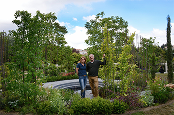
Alladio Sims Garden Landscape Design Ltd was established in 2015 after Jon Sims and Emanuela Alladio collaborated on a Silver Gilt winning show garden at RHS Hampton Court Palace Flower Show. The two directors continue their collaborative approach throughout their practice with Jon’s background in interior architecture giving distinctive spaces and Emanuela’s passion for plants and photographic eye adding great texture and contrast.
essence info
Alladio Sims Garden Landscape Design Limited
Unit C Willow House, Dragonfly Place, London SE4 2FJ
Website: www.alladiosims.co.uk
Email: hello@alladiosims.co.uk